
A Robust Algorithm for Forecasting the S&P 500 Index
“I have but one lamp by which my feet are guided, and that is the lamp of experience. I know of no way of judging the future but by the past.”
- Patrick Henry
Consistently beating the equities markets is very hard to do. Most money managers fail to produce consistent above benchmark risk-adjusted returns. Some managers might exceed a benchmarks returns for a limited period of time, but eventually their luck runs out. This paper describes an algorithm that consistently improves performance in the market relative to the buy and hold strategy, over extended periods, even during difficult and volatile times.
Recent advancements in Artificial Intelligence (AI) and machine learning have demonstrated that equities markets can be timed with sufficient accuracy to significantly improve risk-adjusted returns relative to the traditional “buy and hold” strategy. In particular, the same family of algorithms that understand and recognize our spoken words on smartphones can be used to recognize profitable market opportunities. ITRAC software has been used by large international banks and financial institutions to guide trading. This paper presents and discusses the main concepts, approaches and algorithms used by ITRAC to provide short term forecasts for the S&P 500 index.
Financial models that can generalize can be a complex subject - but it is a topic of critical importance. It is crucial to realize that consistently beating the market is possible. Exactly because it is difficult, there is opportunity. Many successful hedge funds, including Renaissance Technologies have demonstrated the ability to consistently beat the markets. Renaissance is one of the first highly successful hedge funds using quantitative trading— known as "quant hedge funds"—that rely on quantitative models and sophisticated mathematics to guide investment strategies.
A powerful algorithm developed by IntelliTrade, Inc. is used to forecast noisy time-series data, with applications in finance and investing. This computer algorithm is based on discrete statistical mappings, eliminating the subjectivity of most other technical analysis procedures. The algorithm is dynamic, robust, and adaptive. It represents a paradigm shift in that it makes no assumptions of underlying statistics or distributions.
Motivations
The motivation for disclosing this approach is due to frustration in the lack of rigor, discipline- and frankly, the performance of most other forecasting approaches. For example looking at tea leaves and determining what the market may do tomorrow is just wrong. Basing your investment decisions on events like the “tone of political discourse” or macroeconomics seems dubious. We see lots of “Monday morning quarterbacking” on the financial news channels. Recently- after an increase in oil prices- it was reported that a pipeline broke in Peru. Was the news fit to the price action after the fact- or did the pipe breakage actually cause the price increase? Do all pipe breaks in Peru cause oil prices to rise? Can one consistently profit from “news” like that? If, however, you prefer not to shoot from the hip based on unproven anecdotal conjecture, a more quantitative approach is the suggested alternative.
Many question the wisdom of disclosing such a powerful algorithm. Wouldn’t the performance or “edge” diminish as more people began to use this technique in the market? This is a common concern. In fact- there is a term used by industry quantitative analysts (quants) to describe this hypothetical effect. It’s called “alpha decay”- wherein predictive signals are supposedly arbitraged away. However, system performance decay is much more likely due to model overfitting during development- where the performance on back tested data was over-optimized. Alpha decay is probably not due to forced market dynamics restructuring, which is implied by “arbitraging away” the opportunity. Continuing performance on new “virgin” data always suffers and degrades in over-fit models. To assume that a single algorithm can change the underlying structure of equities markets- or change long term human emotions and cognitive biases like fear and greed- which often drive market prices via crowd behavior, herding and group dynamics- is very unlikely. For this reason, the authors are willing to accept the very small risk of alpha decay caused by market restructuring- and attempt to further the science of financial forecasting through cooperative sharing for the good of many. This is in direct contradiction to many quant firms and institutions which are highly secretive about their “intellectual property”. We do in fact hope that this paper reaches as many of our peers as possible: Quants, mathematicians, statisticians, data scientists, and financial systems developers. We welcome all feedback. We believe this is the way to make significant progress on improving and deploying a basic concept once it has been described in enough detail to be reproduced. Reproducing the results would confirm the approach. There are many brilliant software engineers from all over the world including India, China, Germany, etc., who can look at these algorithms with a keen eye and new perspectives. Fortunately, for now, it is still legal for foreigners to invest in U.S. equities, so anyone with sufficient skills and intellect stands to profit from this disclosure.
How to Proceed
How does one determine how to make consistent, above “normal” returns? You can do your own research, write you own algorithms, verify your work and if you have enough time, energy and luck, perhaps discover an edge. Or you could follow some of the many commercially available systems long enough to determine if they really do have an edge. (Very few do.) Unfortunately, it takes a very long track record (typically years) to accurately distinguish luck from skill in this business. I’m sure you’ve heard the saying “everyone’s a genius in a bull market.” Unless you’ve monitored a systems performance through several difficult market periods, (i.e., 1987, 2008, etc.), you really don’t know much about the systems expected performance in the next difficult market. Your best option is to look under the hood of a system which appears to be successful and then attempt to understand its methodology. If the methods and techniques are something you understand and they appear mathematically sound and statistically correct- then perhaps you might weigh that systems guidance more heavily in your investment decisions. First, let’s quickly review some contemporary market timing systems.
A quick review of at “Contemporary” Technical Analysis
Contemporary technical analysis involves the human interpretation of patterns and charts. The effectiveness of technical analysis is a matter of much controversy, mostly because of this subjective interpretation. A myriad of price patterns such as: triangles, continuations, reversals, breakouts, etc. exist.
A quick search of Wiki yields additional examples like:
- Double top and double bottoms
- Flag and pennants
- Gaps
- Head and shoulders
- Island reversals
- Price channels
- Triangles
- Triple top and triple bottoms
- Wedge patterns
As an example, here is a graphic of the “flagpole” and “pennant” pattern:
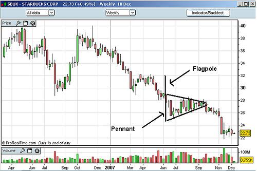
The problem with this approach is the difficulty of specifying the chart patterns in a manner that permits objective testing. All of the patterns shown above are not pinned to either a time or a price axis. They consist of two dimensional patterns with no constraints on time or price. It’s like seeing things in the clouds. Assuming one does subjectively “recognize” one of these patterns- how often, how much, and when would it result in a profitable trade? Very rarely do we get this kind of detailed statistical information. Forecasting should be approached in a methodical and disciplined manner. It should be restricted to objective methods that can be simulated on historical data. In addition, correctly simulating and testing to indicate the expected future performance of a system is critically important. Suffice it to say we view most of these contemporary Technical Analysis approaches as very simplistic, ineffective, potentially very costly and a waste of time.
A Promising New Approach
Let’s look at an approach that is much less subjective. In the next few sections, we will discuss the specifics of the ITRAC algorithm from three different perspectives. They are:
- Image classification.
- Odds- using the familiar Roulette Wheel analogy to simplify explaining some concepts.
- A statistical approach- using binomial proportions and histograms.
Perspective #1: Image Classification
The following shows how ITRAC establishes a classification of patterns or images- in order to objectively specify their likely outcomes. ITRAC uses techniques based on machine learning of patterns. An observation (e.g., an image on a grid) can be represented by values per pixel- or in a more abstract way such as regions of a particular shape.
Let’s begin by defining a pattern called a price “trace.” A price trace is a 2 dimensional plot of closing prices against time- (the horizontal axis being time- and the vertical axis being the percent change of price)- relative to the most recent price in the trace. A trace can be any bounded length of time, for instance, the last 60 days. A sample 60 day “price trace” looks like this: (Note: the trace shown below is the S&P 500 index from 10/03/2016 to 12/27/16.)
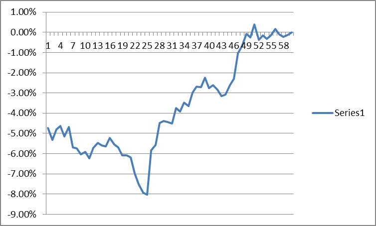
A price “trace” may also be known as an “input vector” in machine learning literature. Note that a “trace” can be defined over any period in the past- or it could be current. Think of it as any n-day segment of the price data, a sliding window. Also note that any number of these different traces can be drawn on the same graph- all plotted relative to their own most recent price. Seven such traces are plotted below- all focused at the far right, each stepped one day back in time:
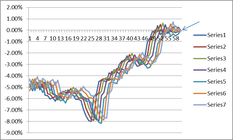
These traces can be thought of as “images of paths”. Each and every S&P 500 closing price has its own history or “trace” associated with it. It also has its own future price(s) associated with it. The task is to associate a “trace image” with its likely future price change in order to make a usable forecast.
Let’s call the surface onto which these traces are drawn on a “MAP”. A MAP is simply a grid or matrix. The MAP is similar to the receptive field commonly used in Convolutional Neural Networks (CNN) for image recognition tasks. The important thing to note is that all of the traces focus into a single point at the far right- (the focal point) because all of the traces are plotted relative to their own closing price at that point.
The next image shows thousands of “traces” from the S&P 500 index time series, all drawn on a “MAP”, focused to a point at the far right. If the price of each particular trace on the next day was higher than the reference closing price, a +1 was added to the matrix cells touched by that trace. If the next days close was lower, a -1 was added to each cell along that trace. The altitude on the MAP surface indicates the wins + losses, i.e., the higher the altitude, the more wins vs. losses in that MAP pixel (cell). Green regions indicate where trace histories resulted in more wins than losses- red areas more losses than wins and white areas are where no traces crossed those cells.
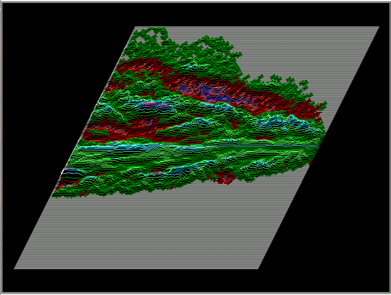
This indicates that most of the traces which resulted in a higher close on the next day (concentrated in the predominantly green areas) approached today’s closing price along a path from the lower left. This suggests the notion of price momentum. Note that much of the red area (indicating tomorrow’s close likely lower than today’s close) exists in the upper portion of the MAPs trace area. This indicates that recently falling prices (in the time scale shown) were more likely to be lower in the future. A forecast can then be made by simply projecting today’s “trace” onto the MAP surface, and noting if it was located in more red, or more green areas as it approached today (the focal point). In this way, one can infer the likely future price. The advantage of this pattern (image) recognition approach is that is it completely objective, reproducible, and testable. It is completely defined mathematically, with no subjective interpretations. That is the general concept of using traces as an image representation for pattern recognition thereby permitting the binary classification of financial time series data.
Let’s further refine the concept. Suppose, in addition to coloring each cell (pixel) red, (which had a lower future price outcome), or green (which had a higher future price outcome), we also count in each cell how many times the trace resulted a higher close (win), and how many times a trace resulted in a lower close (loss) on the next day. After the MAP has been shown all possible “traces” of the time- series, a win/loss ratio could be calculated for each cell on the grid. One could then plot a 3-dimensional MAP surface. The higher ridges would represent areas along trace paths where past prices were more likely to result in a higher future price (higher win/loss ratio)- and the valleys or red areas representing likely lower future prices. Then, to get a forecast for any new trace, we simply superimpose the new trace on the MAP- a (“Convolutional Network Receptive Field”) and sum the values in all the cells that the new trace crosses. This produces a number that is correlated with the likely outcome of that trace: win or loss. In this way, a MAP encodes discrete win/loss frequency distributions.
What we are really doing here is a form of machine learning that is particularly immune to noise and overfitting. By training the MAP (a receptive field) with examples of what happened in the past, we are training the MAP to represent in a statistical manner the likelihood of a positive or negative outcome. The relationship between the recent past price history and its short term future direction is implicitly coded in the receptive field responses. This is part of a statistical binary classifier algorithm which forms the basis of the deep learning systems that are used to make short term S&P 500 forecasts.
Next, let’s look at a MAP where a sine wave was used to form the traces instead of price data. Note the high and low areas of the MAP- and imagine how laying any new trace of that sine wave (of any phase) on the surface, and summing the values of the coincident cells- would yield an indication of its probable short term slope just beyond the focal point:
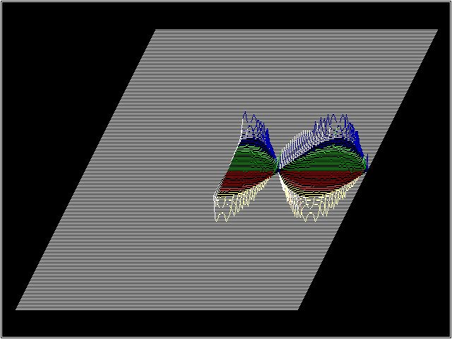
In the above case, a sine wave is completely deterministic, and is easy to forecast. ITRAC uses various deterministic time-series’ to calibrate its forecasting algorithms.
Next, let’s look at a MAP generated from a pseudo-random time series. As is visible, there are no significant ridges or valleys in the MAP surface (mostly just noise), indicating a highly random input time-series data, with very little opportunity to forecast with any usable efficacy.
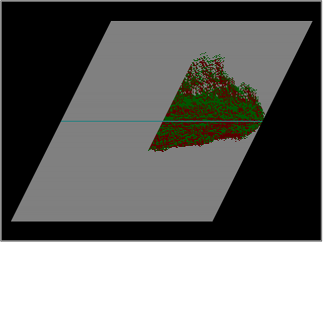
It should be fairly obvious, after studying the above three MAPs, that S&P 500 index prices are neither completely deterministic, nor are they completely random. They exist somewhere between those two “states”. They are predictable, but not perfectly so. Modern computer tools allow looking at data- with machine learning, data visualization, statistical data manipulation and data mining libraries. These tools open up new opportunities to those who have the access and the skills to manipulate them.
Consider that a MAP can be thought of as a “retina” or image field onto which price traces can be projected. In this sense, each MAP is like an artificial eye- which can be trained to “see” market opportunity using statistical pattern recognition via machine learning algorithms. Also consider that there are many ways to project the index price history traces onto the artificial retinas. The trace depth (number of history days) can be altered. Additionally, the y-axis scaling (granularity) can be altered. Both of these have big impacts on the binary classification output of the MAPs surface. There are many other time series transforms that can be applied to the data stream before it’s projected onto the retina, including non-linear Fourier, Laplace, Wavelet and trigonometric/exponential function mixing transforms. Each of these data transformations allows the “eye” to specialize in seeing different patterns that may be presented to it. It is then “trained” to classify the image into its binary class, i.e., win/loss. This is analogous to the “filter layers” used in CNNs.
Below is a surface simultaneously trained with 16 different filters. Each filter uses a different scale, focal point, trace depth and sine wave function mixing to improve overall classification accuracy. Importantly, those MAP building parameters are optimized using Genetic Algorithms (GA). So what we have are many machine trained artificial “eyes” whose characteristics have been evolved to optimize their ability to recognize and classify unseen market time series data. These binomial perceptron fields (as used in CNNs) form the lowest level of the learning classifier.
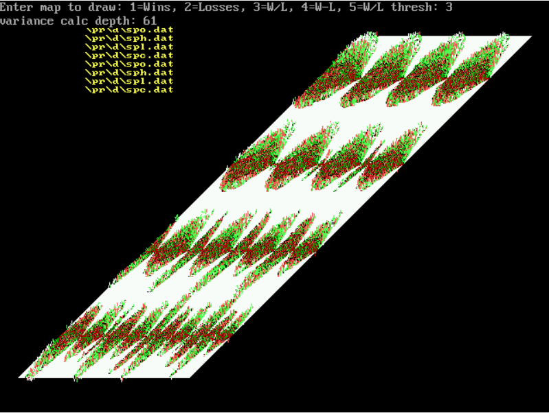
It’s obvious to see the separation of red and green areas on the 16 filters above, clearly indicating the non-random nature of S&P 500 index price changes. If the price changes were sequentially independent and random, the MAPs would be flat without separation of green or red areas, and much more randomly distributed as shown in the random series MAP earlier in this article.
Because these MAP surfaces are image receptive fields matrices, any time series pattern can be projected onto them. If a particular pattern was more likely to result in a higher closing price in the future, it can be differentiated by the MAP and importantly quantified with a confidence interval. Now we can know about the likelihood of ANY chart pattern resulting in a particular binary (win/loss) outcome. The MAPs subsume all of the specific patterns that conventional Technical Analysis uses, and importantly, quantifies them. The MAPs have an extremely flexible representational ability, which is both reproducible and quantifiable. These MAPs are powerful tools for binary time-series image classification.
Perspective #2: Odds

Because it’s an intuitive way to consider binary odds and probabilities, let’s imagine a biased “roulette wheel” with 100 spaces in which the ball can land. Further, imagine that 60 of these spaces are black, and 40 are red. Also, let’s assume we can’t see the wheel directly, but we are allowed to spin it as many times as we like to determine the proportion of red and black spaces. The first spin doesn’t tell us anything about the ratio of reds to blacks; it only confirms that there is a red or a black on the wheel. We don’t know much about the proportion after the second spin either. In fact, it takes many spins of the wheel before we can begin to form an estimate about the proportion of red to black spaces. If we spin (sample) the wheel enough times, we can begin to state with some confidence the proportion of red to black spaces. The binomial proportion is the statistical way to describe what we have in this example: binomial distributions have well known properties, including a way to calculate confidence intervals given the number of samples (spins). In this way we can say with a known confidence level the proportion of red to black spaces. Simply put, the more spins we make, the more we can know about the proportion of red to black spaces. After a sufficient number of spins to learn the ratio with the confidence we require, we would be able to place appropriately sized bets- on black in this case- enough times to profit.
The S&P 500 index has its own proportion of “up” days to “down” days, which we can easily count. Over the last 20 years, the number of up days (where tomorrows close is higher than todays close), was ~53.3% of the total traded days in the sample (5095 samples). The number of down days was ~46.7%. Clearly, the market was biased to the upside over this period, even if only very slightly. However slight this advantage is, billions and billions of dollars are invested into this index, directly or indirectly. Is there a way to improve these odds by avoiding some of the down days?
Let’s now consider a MAP surface, where each pixel (cell) on the MAP can be thought of as a roulette wheel as described above. Each cell on the MAP surface contains the win/loss ratio (indicated below by the color and altitude of the surface) for each trace that crossed that cell during the training phase. The total count (sample size) of each cell is also recorded during training in a separate matrix. Blue/green areas have higher win/loss ratios. Red areas have lower win/loss ratios. Yellow areas have the lowest win/loss ratios. To obtain a forecast on a new trace instance, we simply lay that trace on the MAP surface, and sum all of the win/loss ratios from each cell that the trace touches. If a trace approaches the focal point (today) in mostly red areas, it has a lower measured win/loss ratio historically. If the trace approaches along mostly blue areas, it has a higher historical win/loss ratio. Each pixel is error-corrected for sample size, and the trace pixels are summed and normalized. In the MAP surface below, we see a trace (black) that approaches the focal point (today, for example) transiting through substantial red areas (indicating low historical win/loss ratios). We would expect this trace instance to result in a loss more frequently than a win. Also note that for this MAP, prices appear to be elastic if they don’t fall too fast. However, if they fall too far and/or too fast, the prices appear to be plastic or brittle, and often continue to fall into the future.
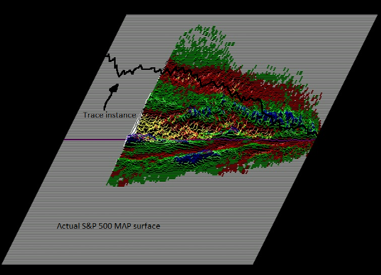
Note: Before summing, the win/loss ratio is corrected for sample size using the: Binomial Proportion Confidence Interval
Basic Sample Size Correction Formula:

where p-hat is the proportion of successes in a Bernoulli trial process. Note that for 95% confidence, z = 1.96 (available from standard “z-table”. With z = 1.0, confidence = 84%). See z-table.pdf
Earlier we disclosed that the daily win/loss ratio for the S&P 500, over the last 20 years (5095 samples), was 53.3%/46.7%. Let’s calculate the 95% confidence interval using the formula above:

Therefore, the 95% confidence interval is a Win proportion ranging from 53.319% to 53.281%.
Perspective #3: A Statistical Approach
From Wiki: Histogram
A histogram is a graphical representation of the distribution of numerical data. It is an estimate of the probability distribution of a continuous variable (quantitative variable). It is a kind of bar graph. To construct a histogram, the first step is to "bin" the range of values—that is, divide the entire range of values into a series of intervals—and then count how many values fall into each interval. The bins are usually specified as consecutive, non-overlapping intervals of a variable. The bins (intervals) must be adjacent, and are often (but are not required to be) of equal size.
The following image shows 20 years of S&P500 traces. The height of the 3-dimensional surface represents the frequency of occurrence. The bins are 1% wide with a range of +/- 100%, and the trace depth is 200 days:
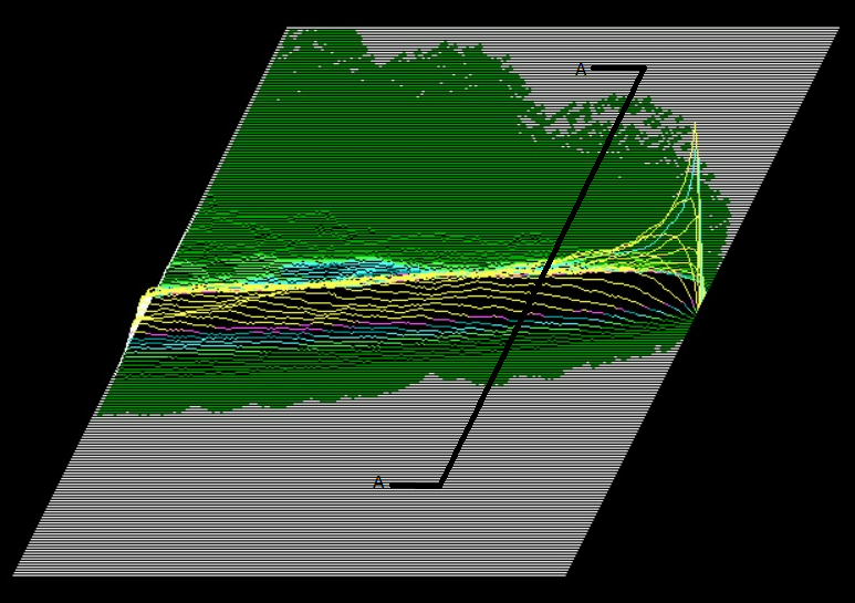
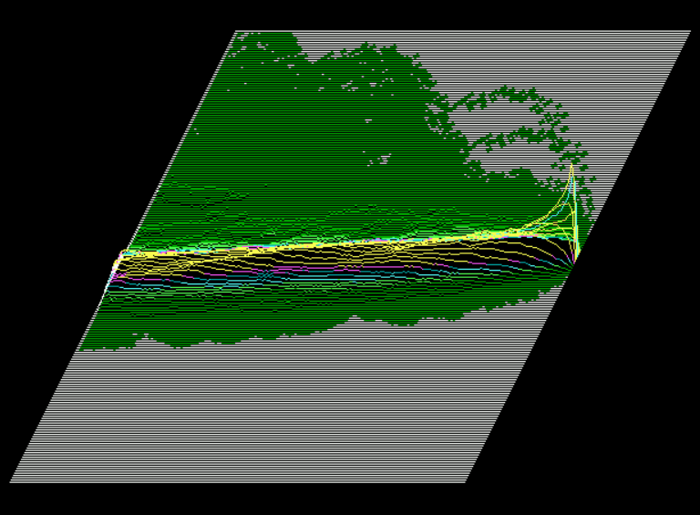
You might realize that any vertical slice of this 3 dimensional surface (section A*A above) would yield a histogram, when viewed into the face of the slice. Where the slice is taken- (how many days in the past from the focal point on the right)- dictates which data points are included in the particular histogram. For example, if the slice is taken 30 days to the left of the focal point, the histogram would tally and depict (for all data in the sample), how many price traces crossed (fell into) a particular bin 30 days in the past. The height axis is the frequency. Next, let’s look at the same kind of surface, but separated by “winners” and “losers” onto different surfaces:
Frequency MAP of winning traces:
Same DATA with just losing traces:
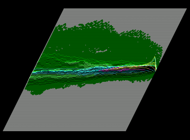
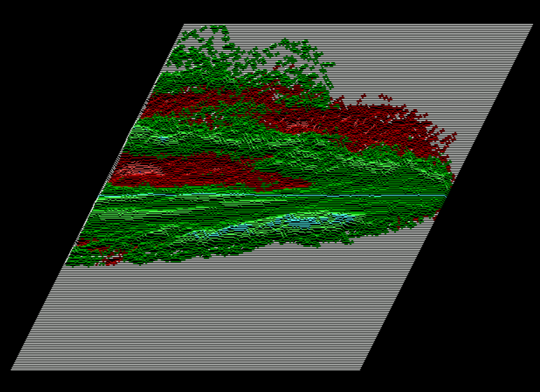
The diagram below is the ratio of the two MAPs above, forming and displaying the WIN/LOSS Ratio. Note the multi-modal histograms that can be viewed from various slices. Also note the non-symmetry of the distributions. Green areas are greater than 50/50 win/loss ratio and red areas are less than 50/50 win/loss ratio. The matrix was “pooled” with a 2x2 averaging operation. (Refer to CNN Pooling Layer)
Overfitting
Avoiding model overfitting and producing generalized models is the most difficult aspect of financial forecasting. One of the reasons for this is the high levels of noise typically found in financial time series data. Extracting the signal from its noisy environment is a task which should rely heavily on statistical analysis. For these reasons, and the importance of avoiding overfit models, we will discuss in more detail how ITRAC avoids this all-too-common pitfall.
Suppose a biased coin which turns heads in 60% of the tosses. Given a sufficiently long sample, we may be able to determine the heads-to-tail ratio and as a result bet consistently that heads will outnumber tails. That betting strategy will not be overfit. This applies to “stationary” systems, meaning the coin does not change its bias over time.
From WIKI:
"The possibility of overfitting exists because the criterion used for training the model is not the same as the criterion used to judge the efficacy of a model. In particular, a model is typically trained by maximizing its performance on some set of training data. However, its efficacy is determined not by its performance on the training data but by its ability to perform well on unseen data. [In contrast, ITRAC never optimizes performance on training data, but uses Out-of-Sample data to measure performance.] The potential for overfitting depends not only on the number of parameters and data but also the conformability of the model structure with the data shape, and the magnitude of model error compared to the expected level of noise or error in the data. Complexity cannot be measured solely by counting how many parameters exist in each model; the expressivity of each parameter must be considered as well." For example, it is nontrivial to directly compare the complexity of a neural net (which can track curvilinear relationships) with m parameters to a regression model with n parameters. A learning algorithm that can reduce the chance of fitting noise is called robust. Because ITRAC's base representation consists of binary proportion accumulators (the cells in the MAP- which can NOT be overfit- because they are fully deterministic frequency counters), the forecasts are extremely robust if properly applied. Financial models typically have parameters which can affect generalization. Model builders know the importance of limiting degrees of freedom and parameter count as a guard against overfitting. The overfit/underfit classification is not an either-or condition. The property of being a general model exists on a continuum between severely underfit and dangerously overfit. An underfit model is probably safer than an overfit model, as the overfit model can give actively misleading forecasts with potentially disastrous consequences. In the case of ITRAC's MAPs, generalization is controlled directly by surface resolution (think “pixel” size).
Let’s consider the two extreme resolution conditions to see how this affects generalization: In the first example, we consider the extreme underfit model- where the surface resolution is so coarse that it consists of a single cell or pixel. In this case, all traces go through this single cell where the win/loss ratio and sample size count would simply be the daily win/loss ratio of all the price points in the data stream. This win/loss ratio was given earlier for the last 20 years of the S&P 500 as 53.3% wins vs. 46.7% losses. If we set our “buy” threshold to anything less than 53.3%, we would be in the market every day, and this is nothing more than the “buy and hold” strategy for this grossly underfit model.
In the second example, we set the resolution to very fine. Perhaps the cell width is only 1/10% and the trace depth (history) is 200 days. (Note that the cell width is really the “bin width” when viewed from the perspective of a histogram). In this example, the MAP will very likely be overfit- because it will simply act as a lookup table. There is too much pattern specificity which prevents generalization. With that fine of a pixel, or cell, the system can discriminate between all of the training patterns it was presented, and will then just be a look up table, reporting back the outcome of every training example presented to it.
Fortunately, both of these extreme conditions can be easily avoided- by dialing in the correct resolution for the MAP, while simultaneously monitoring performance on both in and out-of-sample data. As the resolution is increased from too course towards more fine, the model begins to perform better on both types of data (in- and out-of-sample). Further increases in the resolution, at some point will show continuing improvement on the in-sample data segments, while the out-of-sample data segments will cease to improve. We are now close to the optimal setting for good generalization. Notice that there are VERY few parameters which need tweaking or optimized in this model to dial in the required ability to generalize. Only the resolution needs to be adjusted and its effect on generalization is easily monitored, quantified and viewed in real time. It is possible to walk right up to the edge without overstepping into a dangerously overfit model. The ability to monitor and smoothly adjust the generalizing ability of a model during development is paramount to success in quality model development.
Important tools used to produce generalized models
A generalized time series model is one that continues to perform with minimal loss of efficacy on future data. Unless some method is employed to prevent overfitting, models are not likely to be good performers on unseen data. Neural Networks are notorious for this shortcoming. Their extraordinary ability to represent arbitrarily complex functions is also their Achilles heel. That flexibility allows them to easily model the noise in the data, something that must be avoided at all costs. For a given neural network architecture (structure) and training data set- there are countless combinations of weights and thresholds which can map the given input to the required output on the training data. The final weights and thresholds are in that sense non-deterministic. However, there is only one set of weights/thresholds that does that mapping with minimal overfitting. It is difficult for the modeler to visualize when a model becomes over-fit. What is needed is a powerful representation method that doesn’t increase the degrees of freedom of the model.
Financial model builders need to use development systems and tools that give excellent visibility of the amount of overfitting during the building/training/evolving period of model building (on the fly, during development). This obviously means inventing a method to actually measure and quantify the concept of “overfit”.
Unfortunately, it's hard to always identify what is signal and what is noise. We can segment the return stream, and then use cross-validation to observe the fitness (Sharpe or Information Ratio) of each segment. If we observe a large difference between the training set segments and the (Out-Of-Sample) OOS segments, we know we have over fit the model. We are trying to increase the slope of the entire return stream, (delivering alpha), while at the same time, minimizing the difference in performance between the in-sample and OOS data segments.
So how do we separate the noise from the signal in the data? This is accomplished by sampling the data statistically with enough samples to reduce variance and increase confidence. The Central Limit Theorem (CLT) can be applied here to reduce noise. We can configure the solution to the problem in such a way as to take advantage of the CLT to reduce noise. This is true from the Law of Large Numbers, which says that as the sample size approaches infinity, the sampled probability of a binomial distribution will approach the theoretical population parameter, p.
Cross Validation
Cross validation is a general framework to assess how a model will perform in the future; it is also used for model selection. It consists of splitting the data set into train and test data sets, training the algorithm (classifier) on the training data set- and testing it on the Out-Of-Sample test data set. Because the true values are known on the test data set, one can compare them with your predicted values. Usually the data set itself is split into multiple subsets to compute confidence intervals for predicted values. Both the training and test data sets must be carefully selected- and must include different time frames and different types of observations- each with enough data points, in order to get sound, reliable conclusions as to how the model will perform on future data. Please refer to: https://en.wikipedia.org/wiki/Cross-validation_(statistics) for additional information on this powerful model validation methodology.
It is important to learn the underlying distribution of probable outcomes, as opposed to simply learning to associate inputs to outputs, including system noise, as is too easily done with NNs. With NNs, each training exemplar is used to adjust weights in the stochastic gradient descent algorithm, making a change to the network weights even though a single example is almost statistically meaningless, and may be overwhelmingly just noise. There is no direct mechanism to differentiate between noise and signal. Minimizing error on the training set is the wrong objective, as it also maximizes the pass through or input to output association of system noise. It makes no difference whether this is accomplished with backprop, fractional correction, batch, or stochastic training methods.
A much more useful objective is to learn to output the probability of an outcome or class on Out-Of-Sample (OOS) data, given an input vector. In other words, the objective is to learn the statistical structure of the data, not the individual (training example/outcome) class pairs. Probabilistic classifiers provide classification with a measurable degree of certainty, which can be useful in its own right. Reducing misclassification on OOS data is NOT accomplished by minimizing misclassifications on the training data set.
A common technique used in an attempt to force NNs to generalize is called “regularization”. Some common regularization techniques include weight (hidden unit) pruning, early stopping of training and drop-out. All of these techniques try to induce an NN to be sparse- in an attempt to force better model generalization. They do NOT GUARANTEE a better model. Dumbing-down a model by limiting or reducing units (hidden or input) may not be the best way to encourage model generalization, as this can be taken too far. For example, the human brain is a fantastic generalizer: Even an infant can recognize its mothers face in a very “noisy” environment-despite the fact that the human brain has many degrees of freedom. Simply relying on model simplicity may not be enough for complex, noisy problems. Limiting a model by dumbing it down using regularization techniques like hidden unit pruning often leads to an ineffective model. Neural networks unfortunately do a fine job of mapping input noise to output noise. NNs can’t by themselves differentiate between noise and signal. What is needed is a method that CAN attenuate the noise in the signal i.e., a statistically derived model from the ground up. We need a model that can only “see” from a frequentist point of view, i.e., low frequency occurrences of any event are down weighted because of low statistical confidence- and higher frequency occurrences are given more weight. One occurrence of any training event in a model should be considered anecdotal. It could have been an extreme outlier, (also called a miracle.) NNs aren’t good at handling miracles, and we shouldn’t blindly rely on their outputs to guide our trading/investing tactics.
ITRAC uses basically an input vector (trace) in which non-linearity is introduced by enhancing the input pattern with nonlinear functional expansions. We have found that convoluting (“mixing”) the input traces with trig functions like cosines of various frequencies and phases (heterodyning), is a powerful enhancement. This is similar to convoluting the original signal with trigonometric filters of various frequencies. The GA chooses the best filter frequencies and phases. Those familiar with superheterodyne radio receivers will grasp the utility of this concept quickly. With the proper choice of functional expansions in a feed forward network- the network can perform even better than a multi-layer perceptron structure for the problem of denoising a complex time series corrupted with Gaussian noise. In the presence of additive white Gaussian noise in the traces, the performance of the MAP is found to be superior to other models with regard to generalization.
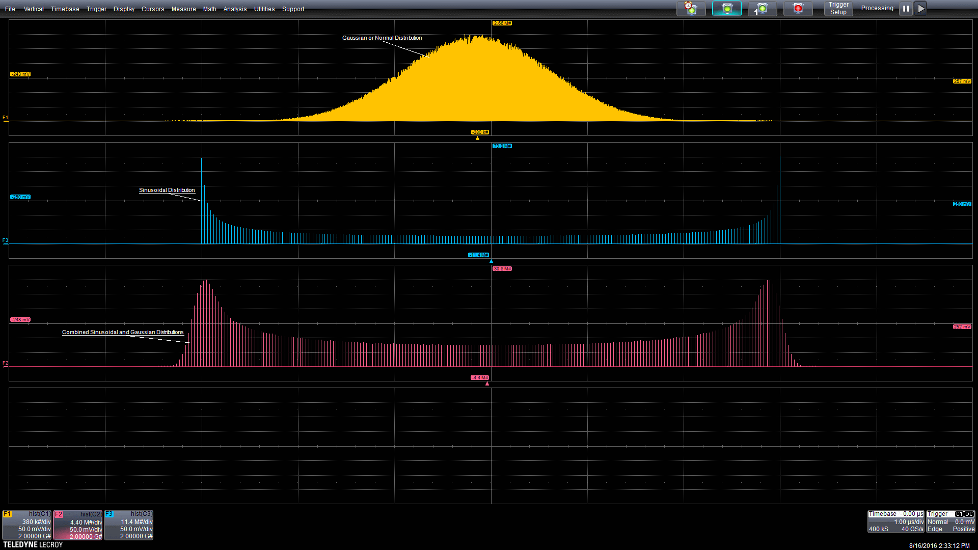
In the example graphic below, two random processes interact. When that happens, the probability densities of the processes are mathematically convolved. A common example in electronics is timing jitter where random and deterministic jitter component combine. The graphic below shows a Gaussian and a sinusoidal component being combined. The source distributions are in the top two grids. The resultant distribution, third grid from the top, is the convolution of the two sources.
Source: convolved distributions
“Everything should be made as simple as possible, but not simpler.”
- Albert Einstein
System Integration Considerations
A good engine by itself does not make a good car. A good car is the sum of all the parts working together in unison. A reasonable forecast by itself is very far from a tradable system. Ensuring “general” model solutions whose performance does not degrade through time is critically important to serious financial modelers. It is the single most important and difficult aspect of quality forecasting. ITRAC’s development systems include the following methods and procedures to ensure general models:
ITRAC uses statistical representations of the market structure at the lowest levels (receptive fields) to combat overfitting and noise as described above. These representations are completely deterministic- and much more impervious to noise than traditional NN approaches. ITRAC uses parsimonious models. ITRAC’s MAPs retain their powerful market structure representation abilities without increasing the models degrees of freedom.
ITRAC uses development tools that give immediate visual and quantitative feedback so that potential overfitting is easily recognized and avoided. This is accomplished by monitoring modelled return stream Out-Of-Sample segments during the cross-validated “trader” evolution, with the aim of keeping the return stream segment slopes and volatility stable through time. ITRAC uses tools that allow us to summarize and view the data and results interactively. It consists of a framework for the creation of strategies to reduce the problem of overfitting. This allows key insights during the development process, including the ability to monitor potential overfitting in real time.
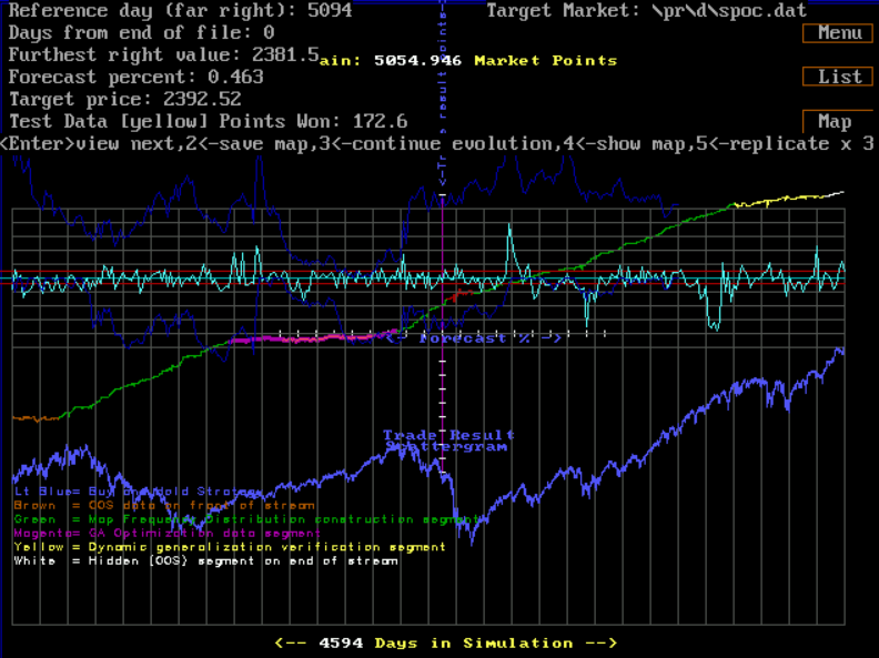
In the screenshot above, overfitting is clearly visible. The training set data (green colored segments in the returns stream) substantially outperforms the Out-of-Sample data (colored magenta and yellow.) Real-time graphical feedback during model development allows us to reject this model as being overfit.
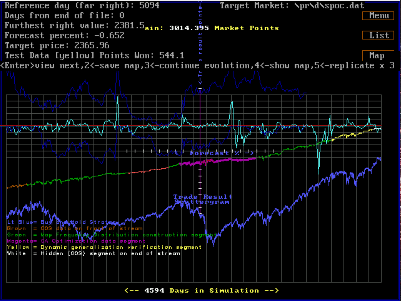
In this screenshot above overfitting is not apparent, as the Training Set Data and the Out-of-Sample data segments of the return stream have similar slopes and volatility. This model can’t be rejected on the basis of overfit from this test. Notice how this model performs very nicely over the crash of 2008 in the OOS return stream segment-magenta. (The crash is shown in the blue graph directly below the return stream.
See: ITRAC Evolutionary Software Video
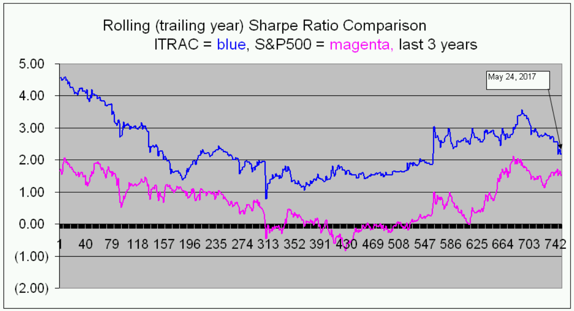
ITRAC uses what are called “artificial traders” (AT). Each AT is evolved using a Genetic Algorithm (GA) which searches for good trading parameters to uses with the forecasted outputs produced by the MAPs. The MAPs are the ATs eyes, and the ATs trading rules and behaviors are evolved with the GA. ITRAC uses sufficient walk-forward real-time validation (years of walk forward validation are used for each candidate AT which may be admitted to the production ensemble). We ensure that each AT walks forward through difficult, volatile market periods so we have sufficient statistical confidence in its future performance. We feel this is difficult, time consuming, and slows system development significantly, but we realize there is no other way to obtain the high confidence we require. ITRAC continues to monitor the performance of each AT in the production ensemble, by reviewing rolling Sharpe Ratios, drawdowns against expectations, returns, volatility, and other metrics. Any AT falling outside of expected performance metrics will be pulled from the production ensemble.
ITRAC uses diversified systems. Each final forecast is the result of an ensemble of ATs, each verified as described above over different time periods and trading parameters. This gives excellent robustness to the systems.
For an introductory video of the forecast development environment, you can view a short YouTube video at: development video
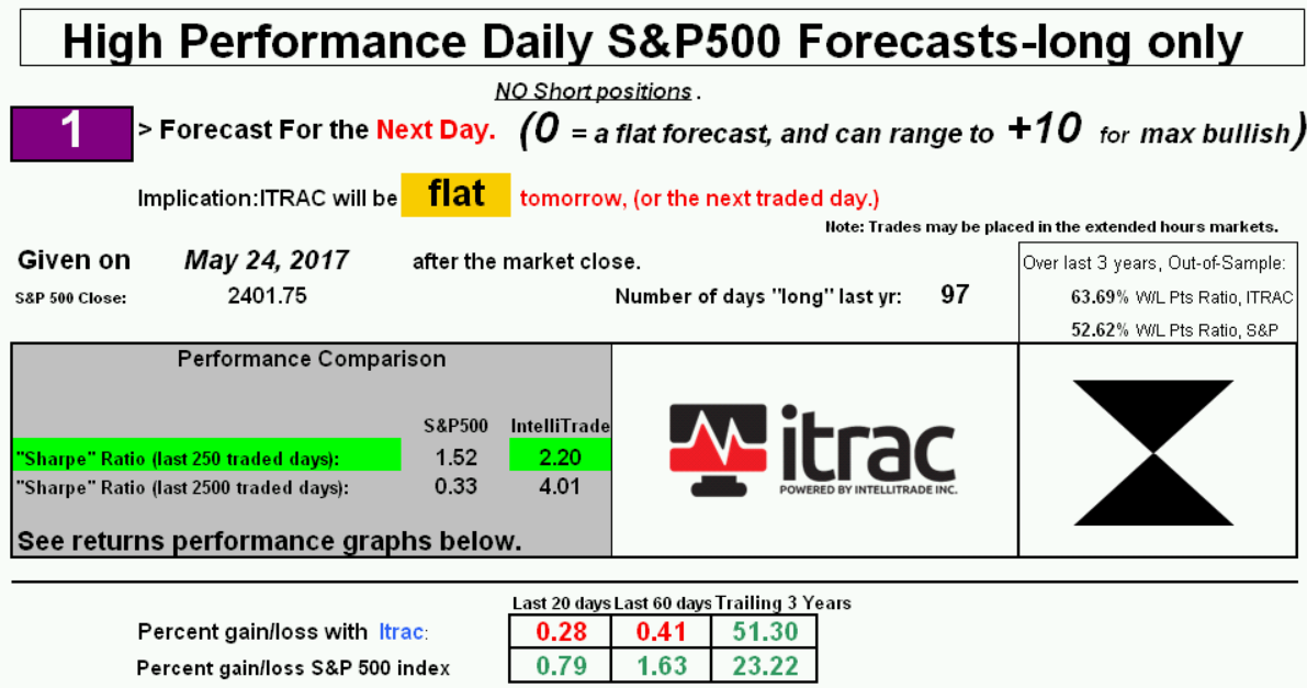
ITRAC is a near term (next day) S&P 500 Index forecaster. This high quality forecast gives either a “long” or “flat” position signal each evening, just after market close on our Website. This information can then be used to modulate position sizes in the extended hours markets to both increase returns and reduce draw-downs and volatility. Position changes occur on average about twice a week, so it is not necessary to make frequent trades. The forecasts are used to enhance performance relative to a “buy and hold” strategy. They can be applied to the S&P 500 index via futures, ETFs, or baskets of equities acting as a proxy to the index, etc. Users can fully modulate their holdings based on the forecast, or they can scale in and out of positions as lightly or aggressively as they choose, depending on their risk tolerance and money management constraints (“portfolio overlay”.) ITRAC uses the algorithms described above in the following way: Each day that the S&P 500 index is traded, the new closing price is appended to the end of the data stream. The system is run on the updated data, and an output is produced. The output is a number from 0 to 10, which represents the skewness of the index outcome distribution on its next close. A 0 output is taken as no skew, while a 10 indicates the likely outcome is skewed the most to the positive outcome on the next traded day. Typically, if that output is above a user set threshold, then a long position is established on the S&P500 index with an after-market-hours trade using an ETF, futures contract, etc. We won’t discuss the mechanics of the trading, or money management issues here. Even though money management and trading mechanics are important subjects, a good forecast is so much more valuable and elusive. In comparison, money management and trading tactics are established disciplines and need not be discussed here.
Each AT has many MAPs as described above, which allow the AT to recognize statistically profitable traces. In addition to evolving the parameters or variables that control the MAP traits (like scale and trace depth), each AT has trading control parameters that are simultaneously co-evolved using GAs. These trading control parameters include things like: thresholds for establishing new positions, number of lots per trade, number of lots allowed on at one time, maximum drawdowns permitted, and other trading control parameters. The GA target fitness metric is a variant of k-fold cross validated (risk-adjusted) returns. By limiting the measure of fitness of each candidate offspring to Out-Of-Sample data, the algorithm is forced to generalize during evolution. Each accepted ATs performance is then monitored in real time for many months (real-time walk forward validation testing). Only after an ATs edge can be verified with sufficient statistical significance- will it be allowed to enter the “trading pool” with other verified ATs. Each AT in the trading pool is permitted to vote on whether to establish a long position in the S&P500 or not. The trading pool (ensemble) consists of dozens of genetically evolved ATs. Their votes are weighted, summed, and scaled. This is the top layer of a deep learning network which has been described to this point. If the final system output (between 0 and 10) is above a threshold, a new long position is established in the extended hours market, and held for one day.
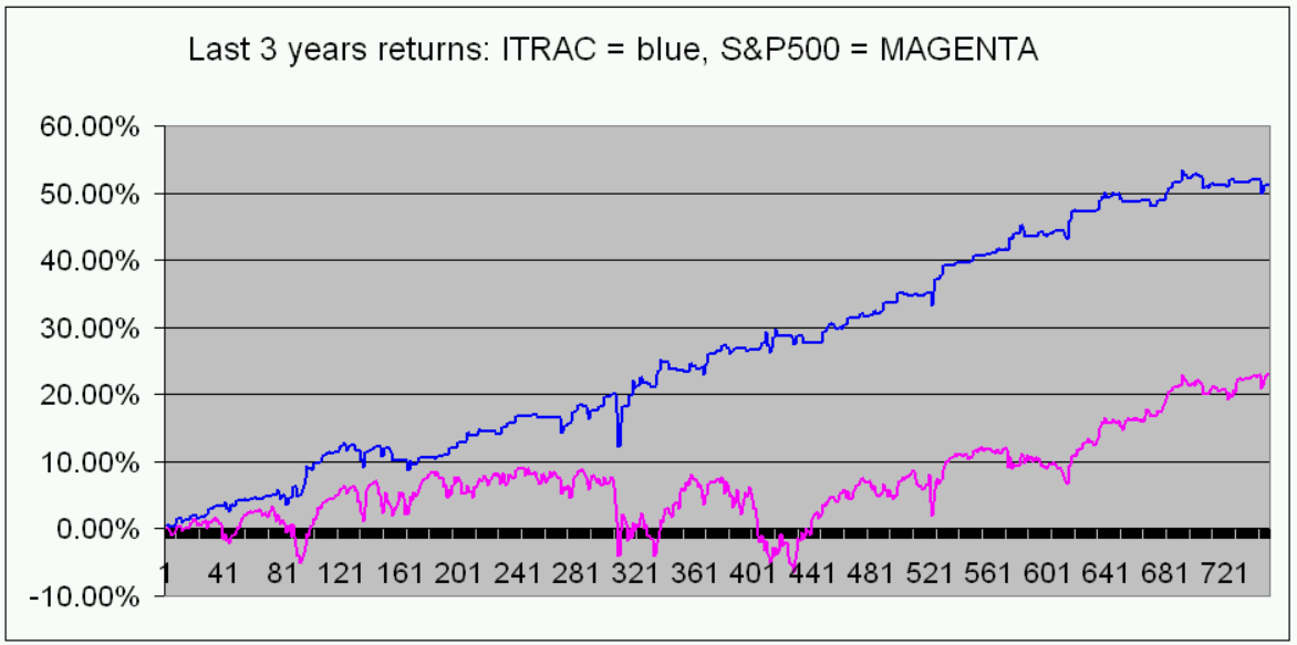
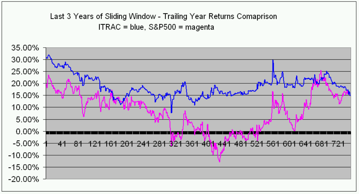
Unlike the “buy and hold” equity index strategy which exposes you to EVERY market turndown, ITRAC is only long the market about 20% of the time. It patiently sits out, waiting for the opportunity to take a quick one-day profit. It strikes quickly and then retreats to the sidelines waiting for the next opportunity. It has an uncanny ability to “see” those opportunities with its genetically evolved pattern recognition MAPs and trading parameters. Its returns are consistently higher, while its drawdowns and volatility are much lower than the buy and hold strategy. It’s not always correct… that’s a pipe dream. But it is very, very good.
In summary, ITRAC uses multiple tools to avoid overfitting:
- Effective K-fold cross-validation techniques with real-time graphical feedback.
- Basic “Proportion” representations which are impossible to overfit.
- Extensive (multi-year) real-time walk forward final validation of each model in the ensemble.
- Exhaustive testing suite and real-time performance monitoring (e.g., rolling Sharpe Ratios, etc.)
These tools, methods and system integration/development environment allow ITRAC to deliver outstanding results. Large institutions can use the information provided by ITRAC to enhance business operations and results that are tied to their share price. Having better information relative to the short term value of your share price is invaluable. Companies like Apple, Inc., Google, etc., whose share price is highly correlated to the S&P 500 index will immediately realize the value of an exceptional S&P 500 index forecast. We know they have the AI experts, model developers and data scientists on staff to understand this algorithm and its potential as outlined in this paper and further quantified on the ITRAC website.
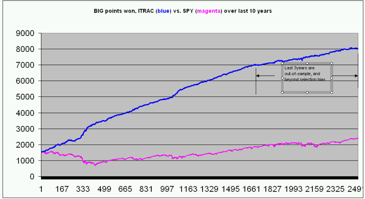
The following is a sample page from ITRAC’s website, showing some performance metrics and information updated on a daily basis:
Final Thoughts
Investing in the equities markets is never without risk. We all understand that investing is an uncertain endeavor. Rational investors attempt to increase the odds of a positive outcome from their investments. In order to play the odds, one must know the odds. Skeptics might say they don’t want to go out on a limb by trying something new. We suggest that if they are invested in equities, they are already out on the limb. ITRAC offers a way to move toward the center of the limb- where risk is less and returns are higher.
This is an introductory look at the systems which have been developed over three decades. Please visit ITRAC for more detailed performance specifications and additional information on the system described above. In quick summary, it has delivered about a 2:1 win/loss ratio advantage using just one day holds, significantly improving returns and Sharpe Ratios relative to the “buy and hold” strategy on the S&P 500 index. It’s like playing a roulette wheel with twice as many black spaces as red spaces - a two to one advantage.
Written By: Christopher P. Wending Aug 28, 2021
“First, you know, a new theory [model] is attacked as absurd; then it is admitted to be true, but obvious and insignificant; finally it is seen to be so important that its adversaries claim that they themselves discovered it.”
- William James
